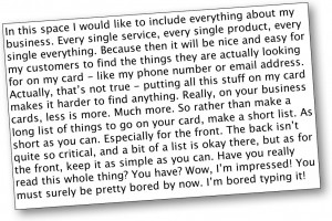
 What should you put on your business card?
We know that we need the fundamental details like name, phone, email, address, web and possibly a short list (perhaps 4 points) of services/offerings. That shouldn’t take up too much space, and if you have a double sided card, you could relocate some of the information to the reverse.
Make it easy for your clients or prospective clients to find the relevant information first – your name and contact. For the rest they can flip the card over.
What about the design? Although all of this is a personal choice, and depends on your sort of business, if we take a corporate or professional approach, here is one way to approach it:
- How many fonts do you use?
- How many colours?
- How many elements?
- How much contrast between colours?
- How much rest or ‘white’ space do you need?
- Do you need photos?
Let’s use Telstra as an example (seeing as everyone knows their brand) – this is how they use those 6 points:
- One for all text and perhaps a second that is defined in the logo itself
- Two
- Logo and one item of branding
- As much as possible
- As much as possible
- No!
If in doubt, use the ‘less is more’ tactic – and you will never have a design that is too busy.