I posted recently about some word salad on the side of a vehicle.
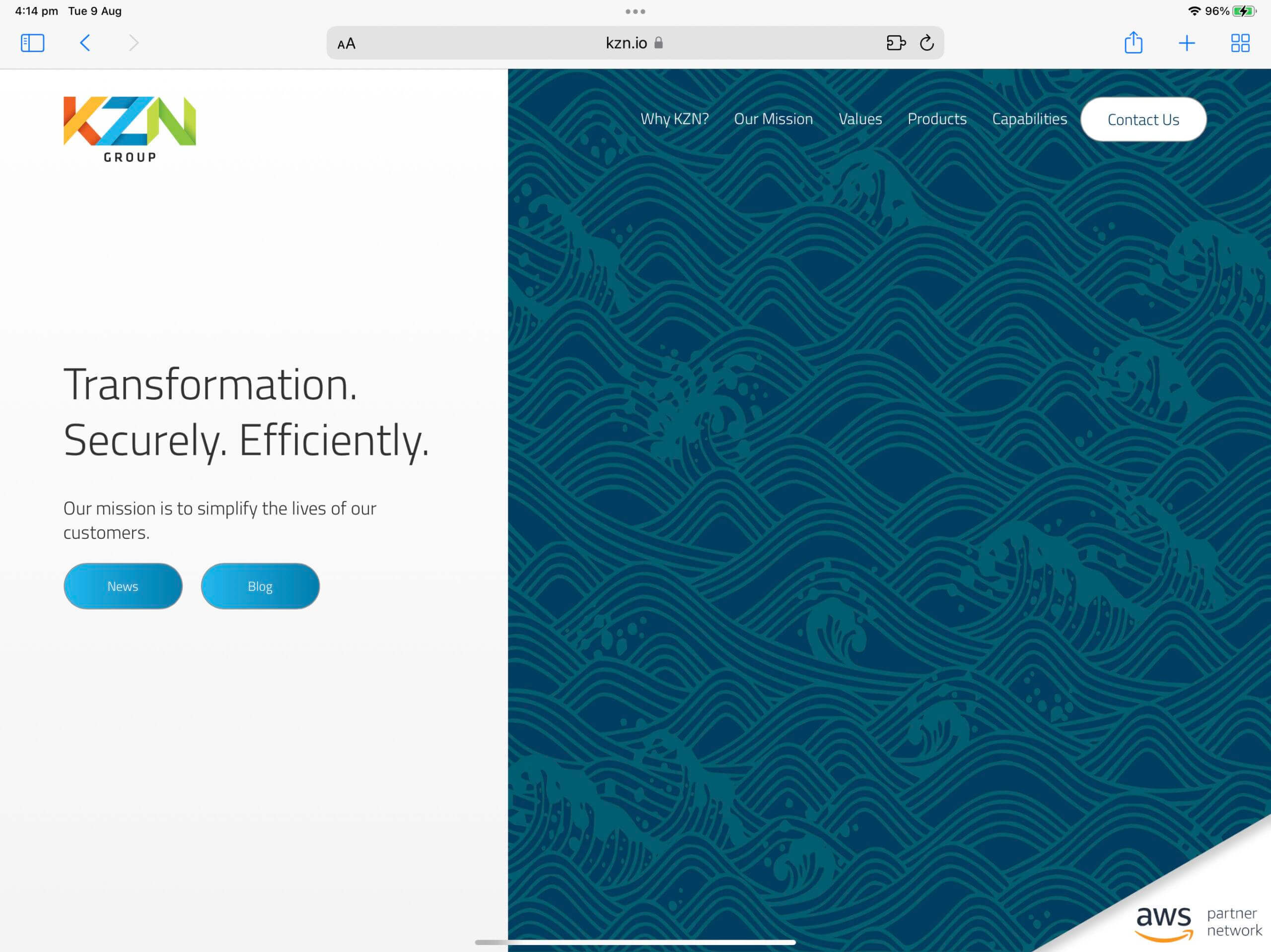
Found another great example today, on this website:

So much to say about this one:
- The name. Another pretty forgettable Three-Letter Acronym. Please stop using TLA’s for your business name!
- The main headline. Transformation: from what to what? Another prime example of word salad.
- A mission statement: You really don’t need your mission statement on your home page. Who cares? (And even as far as mission statements go, it’s still pretty vague)
- Primary calls to action: News and Blog. Are these the main reasons someone is coming to this website?
- Navigation: Again, as vague as it gets. Even this doesn’t give me any clue as to what they do.
- Main image: Still nope. Some kind of crashing wave pattern? Okay, must be something to do with the boating or marine industry then?
- An AWS partner logo in the bottom right corner: Ahhhh, right. Something to do with the cloud.
Do we have any idea what KZN Group actually do?
The only giveaway here is the little Amazon Web Services logo in the bottom right. And even that’s a pretty vague clue.
Here’s a bit of a test:
- Show your home page to someone who doesn’t already know what you do
- Ask them if they know someone who needs “this”
I’m not claiming mine is perfect – definitely a work in progress (so happy to hear any feedback or suggestions!) but please, please don’t do this.
Clarity wins over corporate waffle.