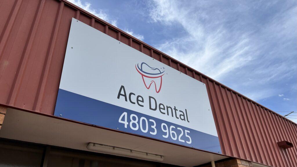
Think of your dentist for a minute.
It’s kind of painful, isn’t it?
I’m not talking about your teeth either here. I’m talking about their logo. Chances are it has a tooth in it.
A dentist logo with a tooth in it is about as cliched as they come. Ouch.
Kinda like this first example:


Now, whether you like the first one or the second one better is not really the point here. The first logo looks kinda like every other dentist’s logo. The second one is different from what you typically see in this industry.
The logo of course is pretty superficial in the grand scheme of things. Vitally important for that first impression, but after that it’s up to the business to deliver on that first impression.
So, a few questions for you:
- Do you want to look like everyone else in your industry?
- Do you want to act like everyone else in your industry?
- Do the “looking” and the “acting” parts correlate?