Video Transcript
When looking to get your logo designed or refreshed, we see a similar mistake over, and over, and over again.
What is that common mistake? Let’s have a look at that today.
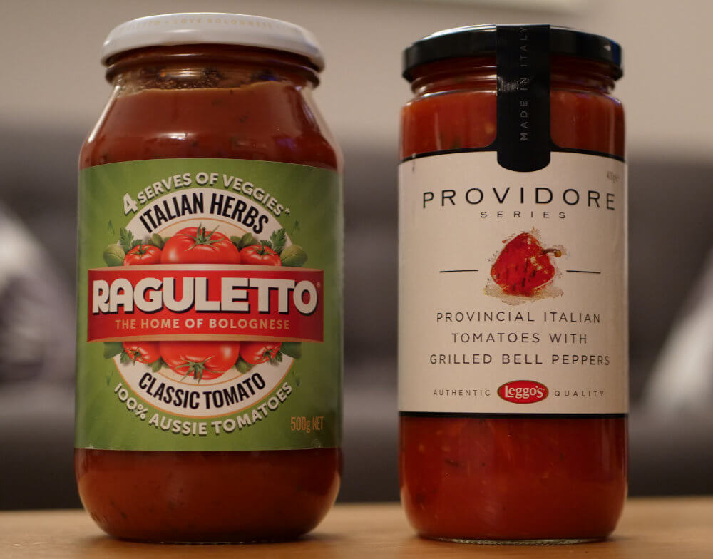
Hi, I’m Jason Foss. To get started today, have a look at these two jars on the screen now.

Now rightly or wrongly, you’ll make some quick assumptions about these jars, which one you might choose, which one you might not choose, which one might be more expensive, which one might be cheaper, which one might be a little more exotic, and which one might be a little bit more conservative.
Now these are very quick judgements that we make. We have no idea what’s inside these jars at the moment. They could have come out of the same factory, for all we know, but we make some assumptions really quickly.
The saying never judge a book by it’s cover exists because we all do it. It’s human nature.
So the point here is that when you’re looking to design your logo, which is part of your overall brand, you should be intentional about how you want people to feel about it.
What should their initial reaction be when they see that logo?
If you have a look at what Chemist Warehouse have done, bright yellow buildings, you see them all over the place.

They look cheap, and that’s completely intentional. That didn’t happen by accident. They’ve gone to a lot of trouble to make themselves look this way, a lot of time, energy, expense, to make themselves look this way. Now, are their prices cheaper or not? If you do your shopping around, I’m sure you’ll have your opinion about that, but when you see that building, that’s the first thing that you see, is that they’re cheaper than everybody else. Now, the chemist up the road, it doesn’t look like this. It may well be cheaper, and unless you went inside and started shopping around prices, you’d be none the wiser. And let’s face it, most of us are too lazy to worry about that.
So you can overcome an inappropriate logo design, but it’s a lot of extra effort. Why not just paint the right picture in the first instance?
Here’s another example. We had a lady come into us a little while ago, and she had her logo on her business cards all designed, and actually, they actually looked pretty good. So we had a chat with her about what business she was in, what industry was in, what services she provided, who her ideal customer was. And after a bit of a conversation, she was doing management consulting, and her ideal customer was a male between about 45 to 60, that kind of window. So having another look at her cards, we realized there was a bit of a disconnect there straight up. They were really dusty pink, lots of lacework and pretty cursive writing all over it. If she was a hairdresser or a beautician or something else like that, they would have been really good, but considering how she was trying to be perceived by her target audience, it was a completely inappropriate design.
And that’s not good nor bad. I’m not gonna make any comments about sexism or anything here. All of us have biases, and we all make really quick judgements about things we see. Again, whether it’s right or wrong is the topic for another day, but it’s human nature, and we all do it really quickly.
So that logo, and the colors, and everything that she had, she really liked. And that’s okay. You have to like your logo, but if there’s a disconnect between how you’re trying to position yourself, and the assumptions, rightly or wrongly, that your client is making about you, well, we’ve got a problem.
If we go back to those jars. The more expensive-looking jar may well be a much worse product, and you wouldn’t know that until you actually bought them, and opened them, and taste-tested them, but people tend not to do that a lot of the time. The label on the jar will be enough, and they’ll make a choice based upon that.
So the main point here is to be intentional when it comes to designing your logo, and your brand, and the look of your business.
Don’t just pick your favorite color. Have a think about how people should feel when they first see your logo. What’s the personality of your brand? Should it be fun, or should you be serious? Should you be a bit exotic? Or should you be conservative? Should you be a bit adventurous? Or you should be a bit safe? Have a think about the emotional response that you’re trying to generate first up, and then you need to have a bit of a look at your competition.
What else is common in your industry in terms of particular designs, or colors, or whatever the case may be?
Do you want another kind of me-to logo that’s not really gonna stand out? Or do you wanna make sure you do something a little bit different to what else is out there in terms of your competition?
So just to reiterate, have a think about your positioning in terms of your competition. Where should you be on certain scales? How should people feel about your brand when they first see it? Be intentional about how your logo should look. It may or may not be your favorite color. It may or may not be your favorite font.
Sure, you have to like it, but ultimately those first impressions that you plant in the minds of your customer are really important. Think about those before you think about what your favorite color is.
I’m Jason Foss. Thanks for watching.